Street Food, Street Art, Street Cred: positioning Mama Chow’s as a Portland Icon

clients: mama chow's kitchen, Portland State University
CollaboratorS: Ann Mcbride, Claire de la mare, nica mork
Mama Chow’s is more than a food cart — it’s been a community anchor where first dates, friendships, and loyal regulars have formed. After earning national recognition (ranked 6th in the U.S. for American Chinese food), owner Jeff Chow is wanting to refresh the brand as he moves into Portland’s trendy Hawthorne district. This speculative rebrand was in a PSU class competition, with Jeff selecting my designs.
Approach
Jeff often remarks on how his fusion food has been greatly influenced by Portland and recognized for its unique quality, making it "Portland iconic." so I started with a question: what makes Portland iconic?
While painting a mural, I found a simple answer— great food and rad street art. This gave us the perfect opening to create a brand that felt authentically Portland, celebrated Jeff’s Oakland roots, and reflected the handcrafted, unpretentious spirit of his food.
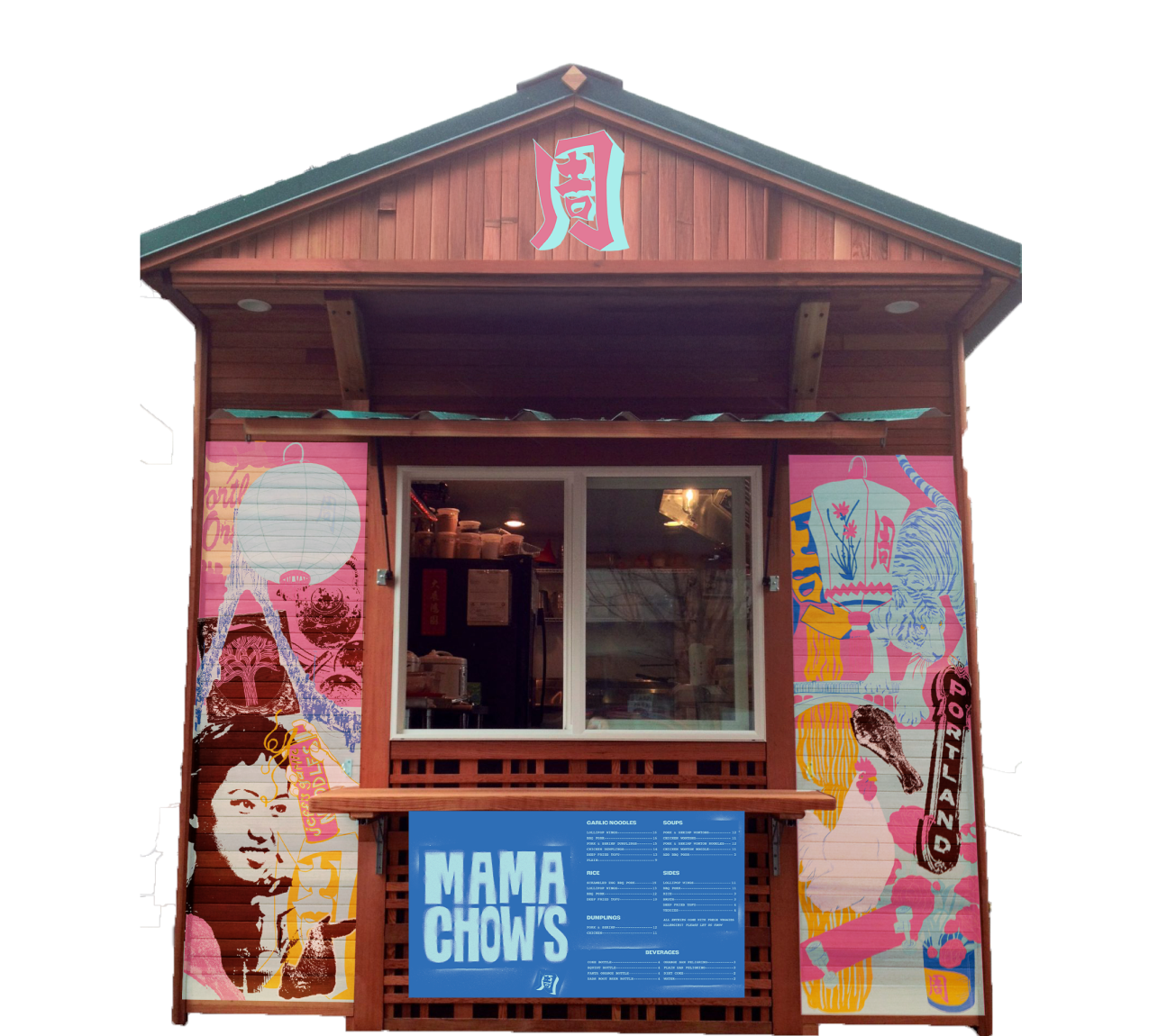
We developed a visual identity rooted in stencil-inspired typography and American Chinatown-influenced color, paired with a kanji icon that honors Jeff’s family name. This identity is flexible, bold, and designed for street visibility.
To extend the brand, we proposed low-cost, high-impact activations like wheat paste posters, mural collaborations, and social media kits—ensuring the brand stays vibrant, community-driven, and easy for Jeff to manage as he focuses on what matters most: the food.
Our approach centered on turning Mama Chow’s into a hyperlocal icon by merging Portland’s love for street art with the authenticity of handcrafted Chinese American food.
Results
The new brand positioned Mama Chow’s as both cool and welcoming, true to its roots while expanding its street presence.
The look and activations create an organic flow of word-of-mouth buzz, social media UGC, and neighborhood loyalty — all while giving Jeff a flexible, future-proof brand system that's easy to manage, and ready for new collaborations with artists from both Portland and Oakland.


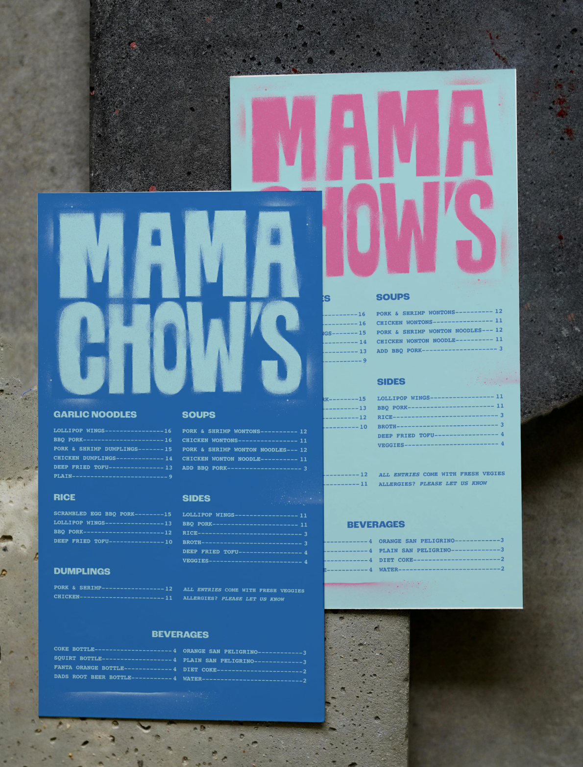
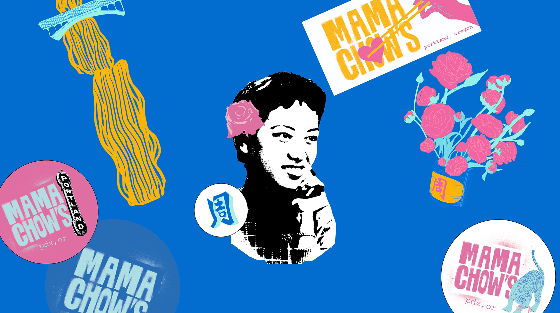
Primary Logo (Stencil Lettering):
The bold stencil look directly ties into street art culture—it's legible, gritty, and instantly recognizable, perfect for catching eyes on a busy street like Hawthorne. It reflects the unpretentious but intentional craftsmanship of Jeff’s food.
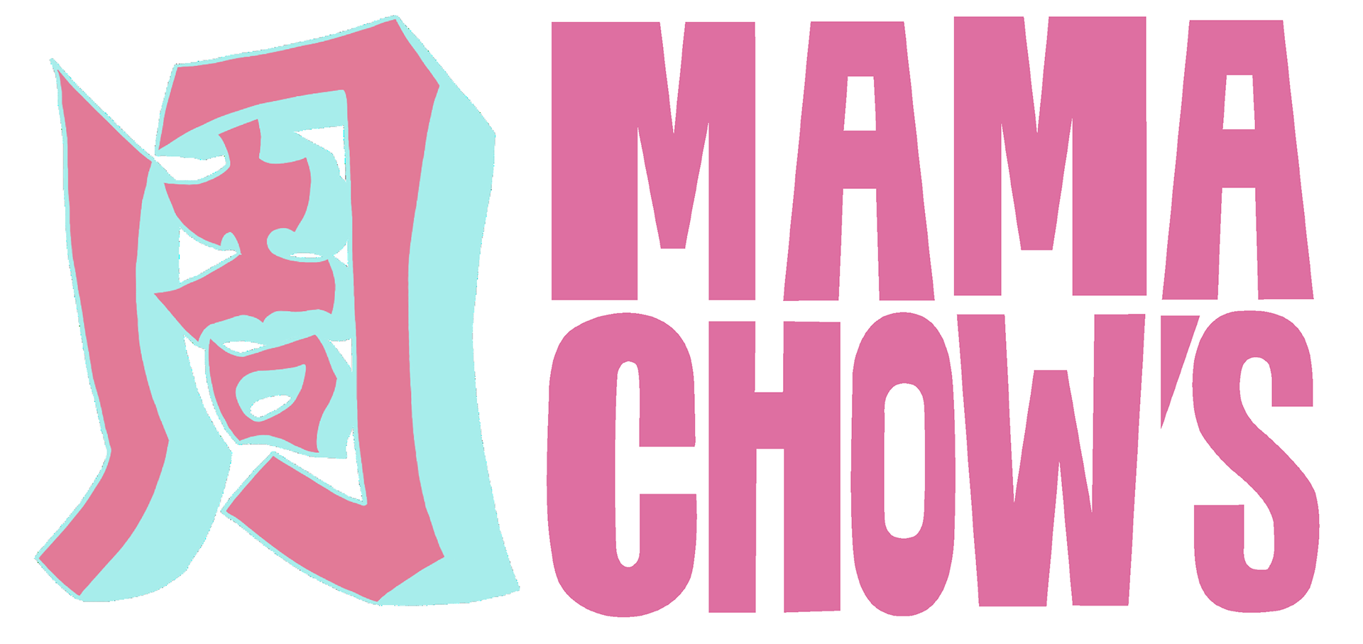
Icon (Kanji for "Chow"):
Honors Jeff’s cultural heritage while visually aligning with the symbolic, image-driven language often used in graffiti and mural art.
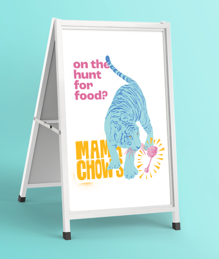
street style out-of-home
Clever guerrilla marketing and signage is a street-smart way to gain visibility with little overhead. It fits the brand’s roots in street culture and offers Instagrammable moments that support UGC (user-generated content) and word-of-mouth.
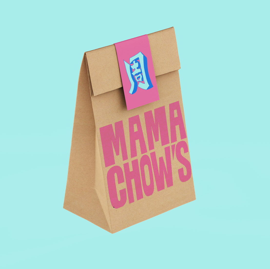
bold art + color At the cart
It’s nostalgic and modern at once— rooted in heritage but designed to pop on Portland’s streets. Our deliverables showcase Mama Chow’s identity as living pieces of Portland’s art scene. It connects the cart physically to its environment and creates ongoing opportunities for community engagement and artistic partnerships—just like Jeff values.

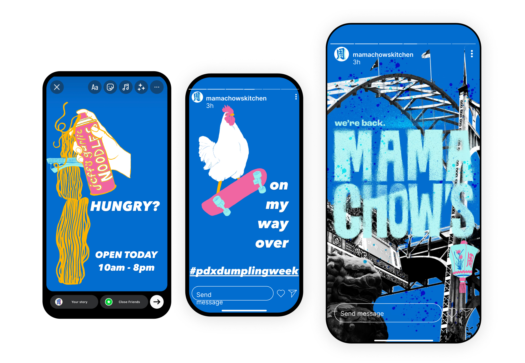
Social Media Kits:
Easy for Jeff to use without sacrificing style. This keeps the brand presence consistent and cool, while letting the food stay the main focus. The DIY feel of stickers and templates keeps it authentic, not corporate.